
What Is A Landing Page (Plus 15 Mistakes To Avoid)
.jpg)
Every business needs an online presence (even brick and mortar) to promote their services and brand.
For some, this means an HTML or WordPress site. For others, it means a dedicated landing page like GrooveCm provides or ClickFunnels.
This landing page is unique in that it provides visitors with a single function and a few simple actions: a single call to action, a button for providing their email address and full name, and a link to their website (optional).
There are many pre-made templates from your favorite funnel builder (landing page maker) platform and all you have to do is customize it to your customers needs.
The key to a good landing page is to provide high-quality content from the top of the page till it ends.
The purpose of a landing page is to acquire visitors' information to send them down a sales funnel for a future offer.
In this article I will show you more about the power of landing pages, why it's better than a website and how you can use a landing page to increase your goal metrics.
What Is A Website?
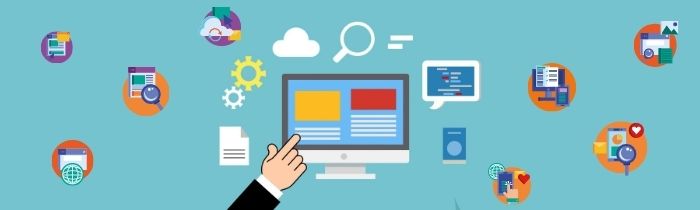
A website is an online presence that provides a business, organization or individual with the ability to interact with their target audience.
Websites offer multimedia content such as text, graphics, audio and video to inform their audience of services they provide and also interact with them through feedback forms and other communication channels.
Websites are the backbone of the internet today. They can be accessed by anyone who has an internet connection, and they provide an easy way for people to find information about anything they're interested in.
A website is a collection of web pages that are connected together by hyperlinks. Websites can be found on many different devices such as laptops, desktops, tablets and smartphones.
Websites can also be accessed from any location using the internet connection from any device.
Landing Page Vs Website: What Are The Differences?
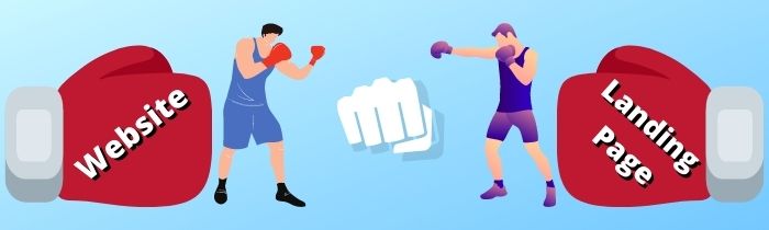
Landing pages are more focused and less distracting than regular websites. They don't have sidebars or links to unrelated content.
This makes it easier for visitors to find what they're looking for on the landing page, increasing the chances of them converting into customers.
Landing pages make it easy for companies to track their conversion rates and then optimize their website accordingly.
Websites, on the other hand, are made up of an organized layout that has all the information about the company laid out in a logical way.
Unlike a landing page, where it’s focus is only to provide useful information regarding the “thing” they are mentioning.
A website is an interactive platform that exists online and it's usually made up of many different webpages that are linked together through hyperlinks which lead the user from one webpage to another.
On the other hand a landing page is a standalone page, with the purpose of ascending the visitor or customer up the funnel till they become a buyer.
Types Of Landing Pages:
Landing pages serve as a central hub for driving traffic to promote your product or service.
There are two types of landing pages: paid and organic.
Paid landing pages are displayed at the top of search result pages when a user enters specific keywords into a search engine.
Organic landing pages are usually found through web crawlers that index websites and rank them according to their relevance to the keyword being searched.
With this in mind, down below I'm going to explain the different stand alone pages you can used for either paid landing pages or organic landing pages.
Presale Page
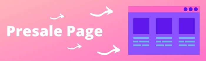
A presale page is a landing page that is specifically designed for the purpose of converting potential customers into paying customers.
It is important to have a presale page because it provides your audience with the opportunity to know more about your product and to see how it will benefit them.
The first thing that people usually do when visiting a presale page is to understand what the offer is.
What are you selling? Why would they need or want it? And, why now? The goal for a presale page is to get visitors to sign up for an email list or give their contact information in order to get more information about the product.
The next page after the presales page should be an order form page if they want to purchase the product.
For this, you need to provide information on pricing and payment options, shipping and handling costs, exchange rates, and various other charges related with purchasing the product.
Other synonyms for presell pages are: survey page, article page and clickpop page.
Opt-in Page
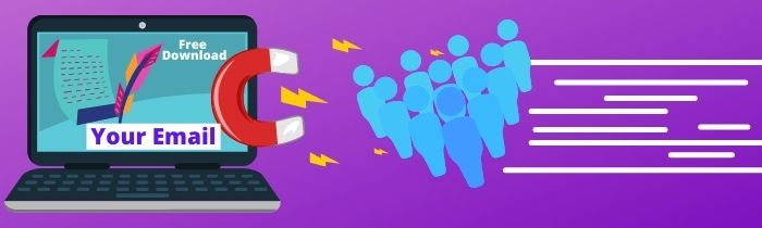
A well-designed opt-in page is easy to use and provides a clear call to action button. It ensures that your visitors are aware that they will receive something in return for their email address.
Opt-in pages are usually used to gather email addresses from people, lead capture page. This can be for marketing purposes, or to give discounts or exclusive offers.
Opt-in pages are a great way for companies to collect information about their customers and find out what they need, which will help them develop better products. However, this is not the only way that opt-in pages are used.
An opt-in page can also be used as a form of advertisement for your product or service in order to generate more sales and leads.
The main advantage of an opt-in page is that you reach more people because it targets those who have shown interest in your company already by providing a freebie or something exclusive.
Other synonyms for opt-in pages are: squeeze pages, reverse squeeze page, lead magnet and coupon page.
Sales Page
Not so much to say about this, but the purpose of a sales page is meant to persuade and convert the visitor into a customer.
Sales page can also be referred to as: video sales page, sales letter page and product launch page.
Webinar Page
Webinars are a great way to get valuable information to your potential customers. However, the pre-webinar page is the place where it all starts.
This is where you have to make a great impression and persuade visitors to sign up for your webinar.
Webinar pages are where you interact live with your sign-up visitors at a set time and date to offer them a unique solution to a specific problem in their lives.
Webinar pages work well for: web classes, live training, workshops and automated webinars...
Membership Page
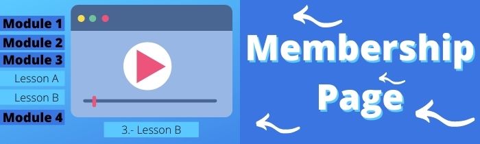
Membership pages are used to give members exclusive access to certain content and special offers. They require passwords so only the people who should be viewing the content can get access.
There are many different ways to get your reader to subscribe, such as with a free trial, discount codes, and interactive content. Not only that but the content has to have quality and be relevant in order for people to want to sign up.
Affiliate Page
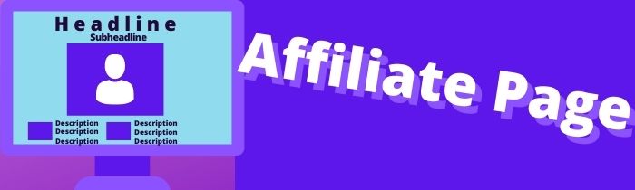
An affiliate page is more focused towards affiliate marketers who want to sell a service or a product that is owned by another advertising company in order to get paid for the sale.
I like to consider it like a pre-sales page where the affiliate marketer is warming up the visitor by providing them knowledge of the product or service, how they can implement the “thing” in their daily lives, and showing testimonials of others using this “thing” between other tactics.
One Time Offer Page
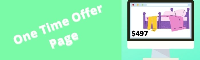
One time offer pages are known as an upsell page. The only way a buyer will land to this page is by purchasing the front end product or service you or the company are offering.
Usually this would be a higher price purchased.
One time offer pages are also known as down sells pages too. If the customer who saw the upsell page did not like the offer, you can then lead to the next page with something of a lower cost but still consider it higher than your front end product or service.
The main purpose of an “One Time Offer” page is to increase your average cart value and this is one of the best ways to do so.
Thank You Pages
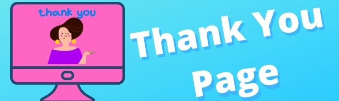
The purpose of a thank you page is to make the visitor feel appreciated for visiting the end of your funnel.
It's important to thank your visitors for visiting your site. You can do this by sending them a confirmation email, or by including a message on the website itself.
15 Landing Page Mistakes To Avoid
Not Being Mobile Responsive

One of the immediate consequences of not having a mobile responsive landing page is that you will not be able to attract potential customers.
In this day and age when more and more people are browsing on their smartphones, it is important to have a landing page which is compatible with all devices.
The other consequence of not having a mobile responsive landing page is that your site may be penalized by search engines like on Google.
If you can't provide an excellent user experience, then your site's ranking will decline.
To Many Distracting Images
Adding too many images to the landing page can make it hard for the user to get the information they need, causing them to leave.
Multiple studies have shown that people are able to retain up to 65% more information when all of the content on a webpage is presented in text form instead of in an image.
Beyond this, it can be argued that imagery may actually negatively impact your conversion rates due to its distracting nature.
If you want your landing pages to be successful, keep your images limited and always be mindful of what the page's goal is.
Not Using A Clear Headline
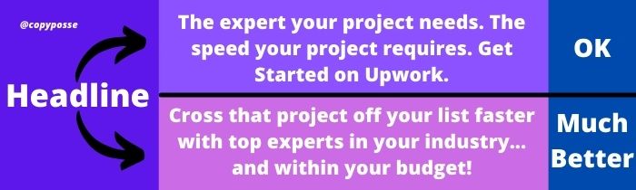
It is easy for one to get lost on the internet and be unable to find what they are searching for. The consequence of not using a clear headline is that a visitor will not know if the page is what they're looking for.
If you don't have a headline, visitors may not know what your landing page is about and they may leave without reading it. However, if you have an attention grabbing headline, you will improve your chances of people clicking on your product or service.
Adding To Many Effects

This is often seen in many landing pages where the user adds a variety of effects like:
flying images every 10 seconds, auto playing audio in the background, chatbot like pop ups asking the visitor to subscribe to everything, animating buttons to grab attention, etc.
This causes the visitor to get very distracted and it can lead to decrease in conversions which we all want to avoid.
Not Having A Specific Goal
.jpg)
A landing page with no specific goal is not effective because it doesn't provide a clear goal for the visitor to take action. You can't expect your visitor to take action if you don't offer them something of value.
The lack of a goal means that the user will not know what it is they are being asked to do. It can cause them to leave the page as they don't have an understanding of what it is they should be doing.
When a person lands on a page, if there is no clear and specific goal, there will be no conversion. The loss of conversions has various consequences such as decreased revenue and increased advertising costs.
One example of this is when someone visits an e-commerce store's website and sees that the goal is to browse products or scroll through social media pages.
If the person does not know why they are in that particular part of the website, their attention span will decrease and they will most likely leave and buy elsewhere.
Having Way To Many Colors

There are many consequences to having a landing page with too many colors. The most noticeable one is the overwhelming feeling that it gives to the viewer. There are also more subtle effects such as a higher bounce rate and lower conversion rates.
The most common color on a landing page is blue because this color has been proven to be the most effective in persuading customers to convert into buyers.
One way of making your site pleasing for users is by saturating the background with blue hues and adding other colors sparingly so they are not overbearing on the viewer.
We know that colors play an important role in how our brain reacts to things we see.
That's why, if you're designing your landing pages, it’s best not to overdo it with color and instead use just a few that are carefully selected.
Not Using SEO (Search Engine Optimization)
.jpg)
If a landing page does not have search engine optimization, it will be difficult to get the content in front of people.
The amount of time that is spent trying to market your content without SEO is literally time wasted. You could be getting traffic and leads by using SEO to rank well for certain keywords or phrases.
Poor SEO means that it is less likely that your landing page will rank in the search engines and consequently, you are less likely to get traffic to your site.
Not only does this mean low conversions, but it also means that you are probably losing out on other benefits of a good SEO strategy.
Search engine optimization is beneficial for many reasons. It can help improve the ranking of your site in the search engines and consequently increase traffic to your site which will lead to increased conversions.
Furthermore, it is beneficial because it helps with the branding of your company and allows you access to valuable data about what customers are looking for.
Ignoring Site Speed
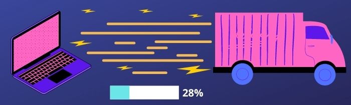
It is important to have a fast loading time in order to make sure that your site can be accessed by a wider range of people.
The consequences of ignoring speed loading time on a landing page are usually that customers will not wait for your page to load, and they will go somewhere else instead. This means that you may lose potential customers, income, and credibility.
The longer a customer has to wait for a web page or an app to load, the more impatient he or she becomes.
You might think this doesn't matter because many web pages are slow and users are used to waiting. But when there is room for improvement, like with your landing page, then every millisecond counts.
Companies can use tools like Google Page Speed Insights to find out how they can improve their page load speeds.
Not Adding Value Proposition

"Value Proposition (in marketing) is an innovation, service, or feature intended to make a company or product attractive to customers" By Google.
Without showing how the product or service can benefit and impact a customer’s life, they are most likely to not take any kind of action.
Personally, I like listing the features and how the customer can benefit from them and providing some examples so the customer can envision how the “thing” can have a positive impact in their life.
Lack Of A Simple Design
A landing page without design is like a house without paint: it looks terrible. A lack of design can lead to low conversion rates, which means that you will not be able to sell products or services.
The copy on a landing page is often important as well. It needs to provide a clear call-to-action and ideally answer any questions about what the company is offering.
A well-designed landing page provides all of this information in an attractive way, which will help to generate conversions and make users feel more comfortable with the company’s offerings.
Not Having Social Proof
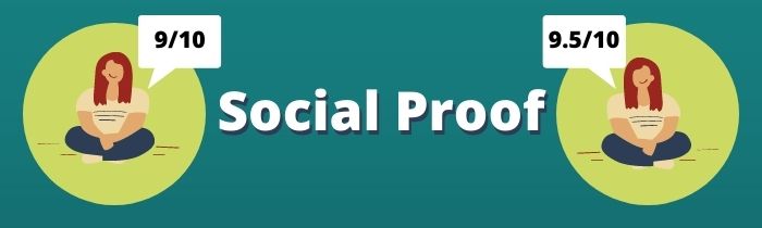
A landing page without social proof can have a negative impact on conversion rates.
Having social proof can make people feel more confident in the product or service that you are selling. If people see that other people approve of what you are offering, they will be more likely to buy from you.
Not Using Tracking Pixel
![]()
A tracking pixel is used for retargeting ads purposes as well as to see your conversion metrics.
One can keep showing the same landing page to the customer by using Facebook ads, google ads, Tiktok ads, Pinterest ads and even Instagram ads, to convert the prospect into a buyer.
Advertising can be costly but if the landing page has a high conversion rate, you'll be winning at the end of the day.
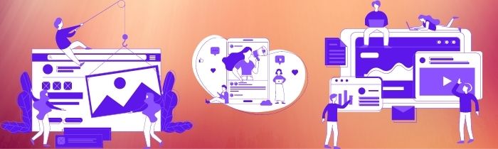
Not Adding A Video (Optional)
.jpg)
A video on a landing page is used to explain the offer on the web page: what the offer is, why you should get it, the features, type of benefits, how it can impact one’s life, etc.
This is usually for the visitors who like to consume information visually and with audio instead of reading the full landing page, article page.
Not A/B Testing Different Elements

A/B testing is a process of measuring two versions of a landing page and then seeing which one leads to the best performance. By running A/B tests, companies can gather data that will help them optimize their website and content.
An example can be CTA buttons. Both landing pages are identical and the only difference would be the button. One might be “Click Here For More” and the other one could say “Learn More Here”.
Another example can be the headline for the landing page. Both landing pages are identical and the only difference would be the headline. One might be “Youtube Traffic Secrets” and the other one could say “Top 10 Youtube Secrets To Drive Traffic To Your Website”.
 Not Using Social Share Buttons (After The Landing Page)
To increase visibility when it comes to your landing page, having a social share button is a necessary element to get more free traffic to your web page.
Not having a share button means you’ll be spending tons of money on advertisement.
When a customer refers your landing page to a friend or family member, the chances of them converting are very high because they trust the person who sent them the information and in their mind everything is validated to them in a positive perspective.
Conclusion
Landing pages have a higher conversion rate because the main goal is to provide high quality content regarding a specific topic to persuade the customer to sign up or purchase the product or service.
Unlike a website where it has a page full of hyperlinks redirecting you from one page to another without the intent of making one to purchase, unless one is willing to do so.
Landing pages play a huge role when it comes to human physiology to convert all visitors into prospects by adding specific elements, specific colors, specific word choice, specific images, structured layout, etc..,
Landing pages only give a visitor two options, one to sign up or purchase the offer or the other one is to exit the landing page, but a website will provide many links and buttons to navigate from one site to another without the intent of making one purchase.
.jpg)