

The Role of Color in Personal Brand Marketing and Psychology

Every aspiring entrepreneur desires to create an enduring impact in the realm of business. But did you know that the colors you choose for your startup can play a pivotal role in shaping that impression?
Yes, the power of color in marketing is profound, influencing up to 90% of snap judgments about products.
As you embark on your entrepreneurial journey, understanding the nuances of color psychology can be your golden ticket to crafting a memorable personal brand.
Imagine walking into a room filled with potential investors or customers.
Before you utter a word, your brand's colors have already spoken volumes. They've conveyed passion, trust, innovation, or perhaps all three. This is the world-class impact of color psychology in action.
The Basics of Color Psychology for Entrepreneurs

Diving into the world of color psychology might seem daunting, but the basics are quite simplistic. At its core, color psychology studies how different shades and tones influence our perceptions, emotions, and behaviors.
For instance, red often evokes strong emotions and symbolizes passion and energy—perfect for a startup aiming to disrupt the market.
On the other hand, blue represents calmness, trustworthiness, and loyalty, making it a favorite among financial institutions and tech firms.
But here's the catch: while certain colors have general associations, individual reactions can vary based on personal experiences, cultural backgrounds, and even gender.
Men, for instance, generally prefer bold colors, while women lean towards softer hues. As a new entrepreneur, it's essential to consider these factors and more when choosing colors for your brand.
Moreover, the context in which colors are presented plays a crucial role. A color that works wonders for one brand might not resonate the same way for another.
It's all about finding the perfect palette that aligns with your brand's values, mission, and target audience.
Decoding Colors for Your Entrepreneurial Brand

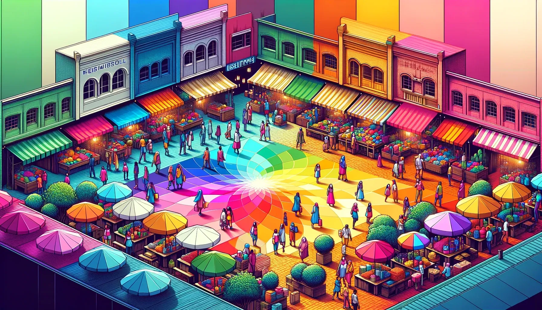
For startups, it is crucial to distinguish themselves in the vibrant marketplace. Your brand's colors can be the difference between blending in and being memorable.
But how do you pick the right shades for your entrepreneurial brand? Let's decode the significance of various colors:
Primary Colors: Making a Strong First Impression
Red
Often associated with passion, energy, and action, red can be a powerful choice for startups looking to convey excitement and innovation. Brands like Tesla and Virgin use red to signify their disruptive nature in their respective industries.
Blue
Symbolizing trust, calmness, and reliability, blue is a favorite among tech companies and financial institutions. Imagine the innovative powerhouses that are PayPal and LinkedIn.
For new entrepreneurs, blue can convey stability and trustworthiness, essential attributes for gaining customer confidence.
Yellow
Representing happiness, optimism, and warmth, yellow can be a bold choice for brands aiming to showcase their fresh and innovative approach.
Snapchat's yellow logo, for instance, stands out in the app world, reflecting its youthful and dynamic user base.
Secondary and Tertiary Colors: Diversifying Your Brand's Appeal
Green
The color green is known for symbolizing growth, sustainability, and new beginnings, which makes it an incredibly adaptable and influential choice.
For startups in the health, wellness, or environmental sectors, green can resonate deeply with the target audience. Brands like Whole Foods and Spotify utilize green to emphasize their commitment to natural quality and growth, respectively.
Purple
Evoking feelings of luxury, creativity, and visionary thinking, purple can be ideal for brands aiming to position themselves as premium or innovative. Consider the branding of companies like Cadbury or Twitch.
Orange
Expressing enthusiasm, creativity, and an adventurous spirit, orange can be a vibrant choice for startups looking to convey their zest and innovation. Brands like Home Depot and SoundCloud leverage orange to reflect their dynamic and creative ethos.
How Specific Colors Resonate with Customers

In the world of marketing and branding, colors are not just decorative elements; they are powerful communicators. Each hue has its own unique story, influencing consumers in subtle yet impactful ways.
As a budding entrepreneur, understanding these nuances can be your secret weapon to resonate with your target audience. Let's delve into the world of colors:
Red
A color that screams passion, energy, and action. Think of iconic brands like Coca-Cola or Netflix. They use red to evoke excitement and grab attention.
For startups, red can signify a bold and disruptive presence in the market, making it a top choice for those aiming to make a splash.
Blue
The epitome of trust, calmness, and reliability, brands like PayPal and LinkedIn have leveraged blue to convey stability and trustworthiness.
For new entrepreneurs, especially in the tech or financial sectors, blue can be a beacon of trust for potential clients and investors.
Yellow
A burst of optimism, warmth, and happiness. Brands like Snapchat have capitalized on yellow to appeal to a youthful and dynamic audience. If your startup aims to bring fresh perspectives and innovation, yellow can be your go-to color.
Green
Symbolizing growth, sustainability, and fresh beginnings, green is versatile and resonates deeply, especially with health-conscious consumers.
Brands like Whole Foods and Spotify have harnessed the power of green to emphasize their commitment to quality and growth.
Purple
Often associated with luxury, creativity, and visionary thinking, purple can set your brand apart. If your startup offers a premium service or a unique product, purple can help convey this message.
Brands like Cadbury have used purple to position themselves as leaders in luxury.
Orange
Bursting with enthusiasm, creativity, and an adventurous spirit, orange can be the vibrant touch your brand needs. It's energetic, youthful, and reflects a zest for life.
Brands like Home Depot have tapped into the energy of orange to reflect their dynamic ethos.
Black
Often denoting elegance, sophistication, and timelessness, black is a color that can give your brand a classic edge. Luxury brands like Chanel and Prada use black to convey a sense of exclusivity and high-end appeal.
For startups aiming to position themselves as industry leaders or premium service providers, black can be a strategic choice.
White
Representing purity, simplicity, and clarity, white offers a clean slate. Brands like Apple and Tesla utilize white to convey innovation, minimalism, and a forward-thinking approach.
For new entrepreneurs, white can be used to emphasize transparency, honesty, and a fresh approach in a cluttered market.
Pink
Often associated with femininity, warmth, and romance, pink can evoke feelings of compassion, care, and understanding. Brands like T-Mobile and Barbie use pink to connect with their target demographics.
If your startup aims to cater to a younger audience or emphasizes care and compassion, pink can be a fitting choice.
Selecting the Perfect Color Palette for Your Startup

The journey of entrepreneurship is filled with decisions, and while some might seem minor, their impact can be monumental. One such decision is selecting the right color palette for your brand.
It's not just about aesthetics; it's about creating a brand identity that resonates with your target audience and stands out in the crowded marketplace.
Tips for New Entrepreneurs: Aligning Colors with Business Values
Reflect Your Mission
Your brand's colors should mirror its core values. If sustainability is a cornerstone of your startup, shades of green can be a fitting choice.
On the other hand, if innovation and creativity are at the helm, vibrant colors like orange or purple might be more apt.
Consider Your Audience
Discover the depths of your target audience. Understand their preferences, cultural backgrounds, and emotions tied to certain colors.
For instance, while blue might evoke feelings of trust in many people, it could be perceived as cold or distant in some cultures.
Avoiding Common Pitfalls: Ensuring Authenticity and Consistency
Overcomplicating the Palette
While it's tempting to use a myriad of colors to showcase diversity, it can lead to a confusing brand image. Stick to a primary color palette and use secondary colors for accents and highlights.
Inconsistency Across Platforms
Your brand's colors should be consistent across all platforms, be it your website, social media, or offline marketing materials. Inconsistency can dilute your brand's identity and confuse your audience.
Ignoring Feedback
As you test out your brand colors, gather feedback from potential customers, peers, and mentors. Sometimes, an external perspective can offer invaluable insights that you might have overlooked.
Strategic Color Combinations for Market Distinction
Differentiation is the crucial factor for success in the vast sea of startups and brands. While your product or service quality plays a pivotal role, the visual representation of your brand, especially the colors, can be a game-changer.
Strategic color combinations can not only enhance your brand's visual appeal but also create a distinct market identity.
Understanding Complementary Colors
The Power Duo
Complementary colors are those that sit opposite each other on the color wheel. When used together, they create a striking contrast.
Think of the combination of red and green, or blue and orange. These pairings can make your branding materials pop and grab attention instantly.
Balancing Act
While complementary colors are visually appealing, it's essential to balance them correctly. One color should dominate, while the other acts as an accent. This ensures that your branding doesn't become overwhelming.
Harnessing Analogous Colors
Harmonious Blend
Analogous colors are those that sit next to each other on the color wheel. They create a harmonious and cohesive look. A combination of blue, blue-green, and green can evoke feelings of tranquility and trust.
Subtlety is Key
Since analogous colors are similar, it's crucial to choose one dominant color and use the others as accents. This creates depth without overpowering the design.
Monochromatic Magic
Unified Look
A monochromatic color scheme involves using different shades and tints of a single color. This can create a sophisticated and unified brand image. For instance, using light, medium, and dark shades of blue can convey stability and trustworthiness.
Depth and Dimension
While sticking to one color, playing with its various shades can add depth and dimension to your branding, making it visually appealing.
Triadic Triumph
Dynamic Trio
Triadic colors are evenly spaced on the color wheel, like red, yellow, and blue. They provide a striking contrast while still maintaining a sense of harmony.
Balancing Act Revisited
With three colors in play, it's essential to ensure one dominates and the other two are used as accents. This keeps the branding vibrant yet cohesive.
Cultural Sensitivity: Adapting Colors for Diverse Audiences

In today's globalized world, startups often cater to a diverse audience spanning multiple countries and cultures.
While color psychology provides a foundational understanding of how colors influence perceptions, it's essential to recognize that these interpretations can vary across cultures.
As a forward-thinking entrepreneur, adapting your brand's colors to resonate with different cultural groups can be a game-changer.
Understanding Cultural Nuances in Color Interpretations
Red
In Western cultures, red often symbolizes passion and excitement. However, in Eastern cultures, it's associated with luck, prosperity, and celebration.
For instance, red is considered auspicious in Chinese culture and is widely used in weddings and festivals.
White
While white signifies purity and innocence in many Western cultures, it's often associated with mourning and death in some Eastern cultures, especially in countries like India and Japan.
Green
In the West, green is linked to growth and freshness. In contrast, in some Middle Eastern cultures, green has religious connotations and represents Islam.
Yellow
While yellow is seen as cheerful and optimistic in the West, it can be associated with jealousy and deceit in some African cultures.
Tips for Culturally Sensitive Branding
Research Your Target Audience
Before finalizing your brand's colors, invest time in understanding the cultural backgrounds of your target audience. This will ensure that your brand resonates positively across different demographics.
Seek Local Insights
Collaborate with local experts or conduct focus groups in specific regions to gather feedback on your color choices. This can provide invaluable insights and help avoid potential cultural faux pas.
Stay Flexible
Be open to tweaking your brand's colors for different markets. Global brands often adapt their logos and branding materials to align with local preferences and sentiments.
Digital Branding for Entrepreneurs in the Digital Age

In today's digital age, where online presence is paramount, the colors you choose for your brand can make or break your digital branding strategy.
As an entrepreneur, it's essential to understand the profound impact colors have on consumer perceptions and behaviors.
Harnessing the Power of Color Psychology in Digital Marketing
Red
This color screams excitement, passion, and energy. It's no wonder brands like Netflix and Coca-Cola utilize red to grab attention and evoke strong emotions. For digital startups aiming to make a bold statement, red can be a game-changer.
Blue
Representing trust, calmness, and reliability, blue is a staple in the digital world.
Tech giants like Facebook and LinkedIn have harnessed the power of blue to convey stability and trustworthiness. For entrepreneurs in the tech or financial sectors, blue can be a beacon of trust in the digital realm.
Yellow
Bursting with optimism and warmth, yellow stands out in the digital space.
Snapchat and other brands use the color yellow to attract a vibrant and young online audience. If your digital brand aims to bring fresh perspectives, yellow can be your digital signature.
Green
In the digital world, green signifies growth, sustainability, and innovation. Apps like Spotify and platforms like Shopify use green to emphasize growth and user-friendliness.
For startups focusing on health, wellness, or eco-friendly solutions, green can resonate deeply with online consumers.
Purple
In the realm of digital branding, purple evokes feelings of luxury, creativity, and innovation. Platforms like Twitch use purple as a means of expressing creativity and innovation.
If your digital brand offers premium services or innovative solutions, purple can set you apart.
Orange
Reflecting enthusiasm and creativity, orange shines brightly in the digital landscape. Brands like SoundCloud and HubSpot tap into the vibrant energy of orange to reflect their dynamic and innovative nature.
The Role of Color in Digital Conversions
Strategic Color Placement
The placement of colors on your website or app can influence user actions. For instance, a red 'Buy Now' button can prompt quicker purchase decisions compared to a neutral color.
Consistency is Key
Ensure that your brand colors remain consistent across all digital platforms, from your website to social media profiles, to create a cohesive brand image.
A/B Testing
Regularly test different color combinations on your digital platforms to determine which hues drive the most conversions and engagement.
Iterating on Brand Colors as Your Business Grows

The entrepreneurial journey is dynamic, with businesses evolving and adapting to market demands, trends, and feedback.
As your startup matures, it's essential to revisit and potentially iterate on your brand colors to ensure they remain aligned with your evolving brand identity and values.
Understanding the Need for Change
Feedback and Perception
As you interact with your audience, gather feedback on your brand's visual identity.
Sometimes, the colors that seemed perfect at the outset might not resonate as you had hoped. Listening to your customers can provide insights into any necessary adjustments.
Expansion and Diversification
As your startup grows and possibly diversifies its product or service offerings, your original color palette might need a refresh to encompass the broader scope of your business.
Cultural Considerations
If you're expanding globally, cultural perceptions of colors can vary significantly. What's appealing or positive in one culture might have a different connotation in another. Being culturally sensitive and adaptable is crucial.
Steps to Iterative Color Refinement
Research and Analysis
Dive back into color psychology, understanding the emotions and perceptions each color evokes. Tools like SEO.app can provide insights into trending colors in marketing, helping you stay ahead of the curve.
Testing and A/B Experiments
Before fully committing to a new color scheme, test it. A/B testing on your website or marketing materials can provide data on how your audience responds to the new colors versus the old ones.
Consistency is Key
While iterating, ensure that the changes are consistent across all platforms and touchpoints. This consistency reinforces brand recognition and trust.
Seek Expert Opinions
Sometimes, an external perspective, especially from experts in branding and design, can offer invaluable insights. Collaborate and seek feedback to make informed decisions.
Conclusion: Discover the Impact of Color on Your Entrepreneurial Journey
Every entrepreneur dreams of creating a brand that leaves a lasting impression, and the colors you choose play a pivotal role in this journey.
The hues you select for your brand are not just about aesthetics; they are silent communicators, shaping perceptions, evoking emotions, and influencing decisions.
As you reflect on the insights shared in this guide, remember that the power of color psychology in marketing is profound.
Up to 90% of an initial impression comes from color alone, and the right color choices can increase brand recognition by a staggering 80%.
These statistics emphasize the importance of choosing your brand's color scheme wisely.
But beyond the numbers, it's about crafting a narrative that resonates with your audience.
As a new entrepreneur, your brand's colors should reflect its core values, reflect its mission, and appeal to your target demographic. It's a blend of science, psychology, and art, and the choices you make can set the stage for your startup's success.
In the bustling world of entrepreneurship, where every decision can shape your brand's destiny, let the colors you choose to be a beacon of your vision, passion, and commitment. Here's to a colorful and successful entrepreneurial journey!